

In my profession I think a lot about color. I think equally as much about how to present color. I recently drove off from the old color-board idea, and instead, talked my way thought images that conveyed my proposed color scheme in a multitude of ways. For this series below I was proposing a palette to match and coordinate with our prior selections of SW colors Moody Blue and Harvester.

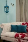
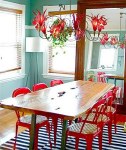
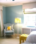
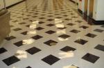
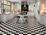
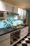
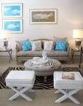
The rooms below show a saturation of color as compared to the one that follows that uses the same colors to accent a white palette.


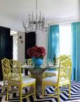
The rooms above show a saturation of color as compared to this one that uses the same colors to accent a white palette. Notice that in the images of color saturation the eye often rests on rigid, structured patterns. See the parquet rug, the checkered wall and the zig zag carpet?
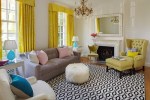
By giving a field regularity with color opposites you create an interesting, deeper background. The background, as you can see, may take on many forms.

~

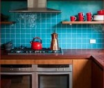
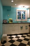
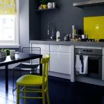
Different hues can be picked up with the texture of materials, color, and type of furniture. You must know what the room is used for before beginning to arrange the color interaction. You can use color to focus on certain things, or use it as a background that fades away. Look at the photo above. Do you really see the white cabinetry?
The floor compliments the space by drawing your eye away from everything else going on.

……………………………..
 ……………………………..

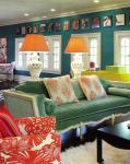
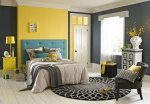
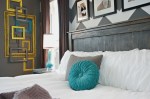
These above images give interest in the pop and placement of color. The placement is meaningful and in balance. The white, color, and pattern interact and add interest in different ways. We can do this with a deep dark color too. I like to call this use of color ‘color blocking.’ Color blocking creates fields of color as a background to the furniture and inhabitants. You may use rich, deep colors to create cohesiveness and enhance the functions of a room.

I think color blocking is best used in small spaces, where pattern and movement of too many textures and colors can become overwhelming. The dark color is restful.
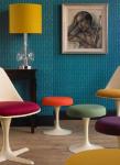
The next thing I did was introduce more colors into the scheme for my client. After making a case for the moody blue, harvester and reserved white, I added a little ablaze, vigorous violet and wisteria.

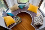
These colors can be used as focal points as a way of puncturing the patterned backgrounds or used to draw attention to a key place in our plan.


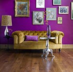
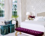
This is a plum nice focal point. The strong use of color is punctuated by the glamorous shade of gold.

The photo below displays a rich background color, and using the black lines of the base mold, the black furniture is brought in as a symbol of similarity. The energetic use of color needed consistency, and white is the perfect color for this. The white base allows a collection to be on display and the lesson is a good one. If we want to display many unique artifacts, let us make them a collection by some sort of consistency.

Another dark scheme using red as a break and accent to the deep blue.


As a closing thought, before you are let off to look through all of these images once more, look at the balance and focal point of color. Use color to liven up a space, add interest, or communicate purpose. See the use of red popping out in the above photo? Where is it used and why?
~


The photos displayed here are not my own. I found them through image searches on the internet. If you’d like your particular photo tagged, please send me your information.

One reply on “Color Saturation”
Reblogged this on purpleplusdesigns.