.The Case for Color.
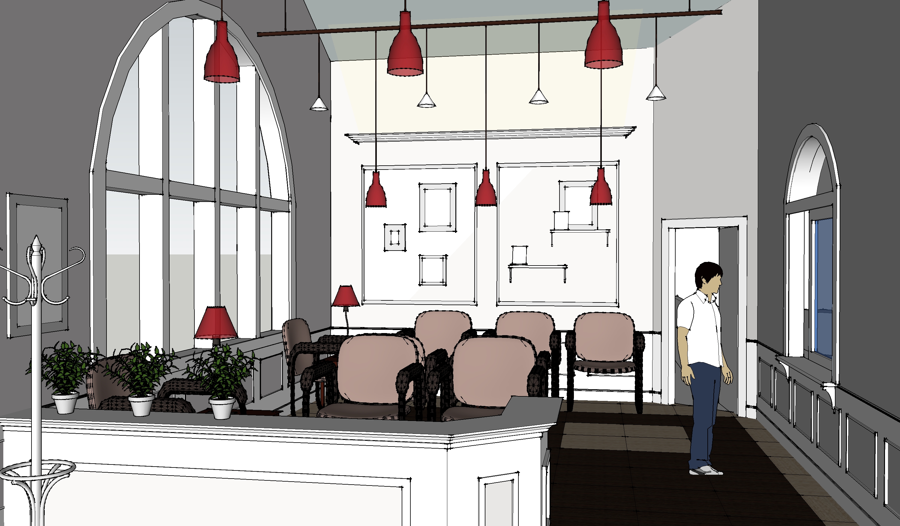
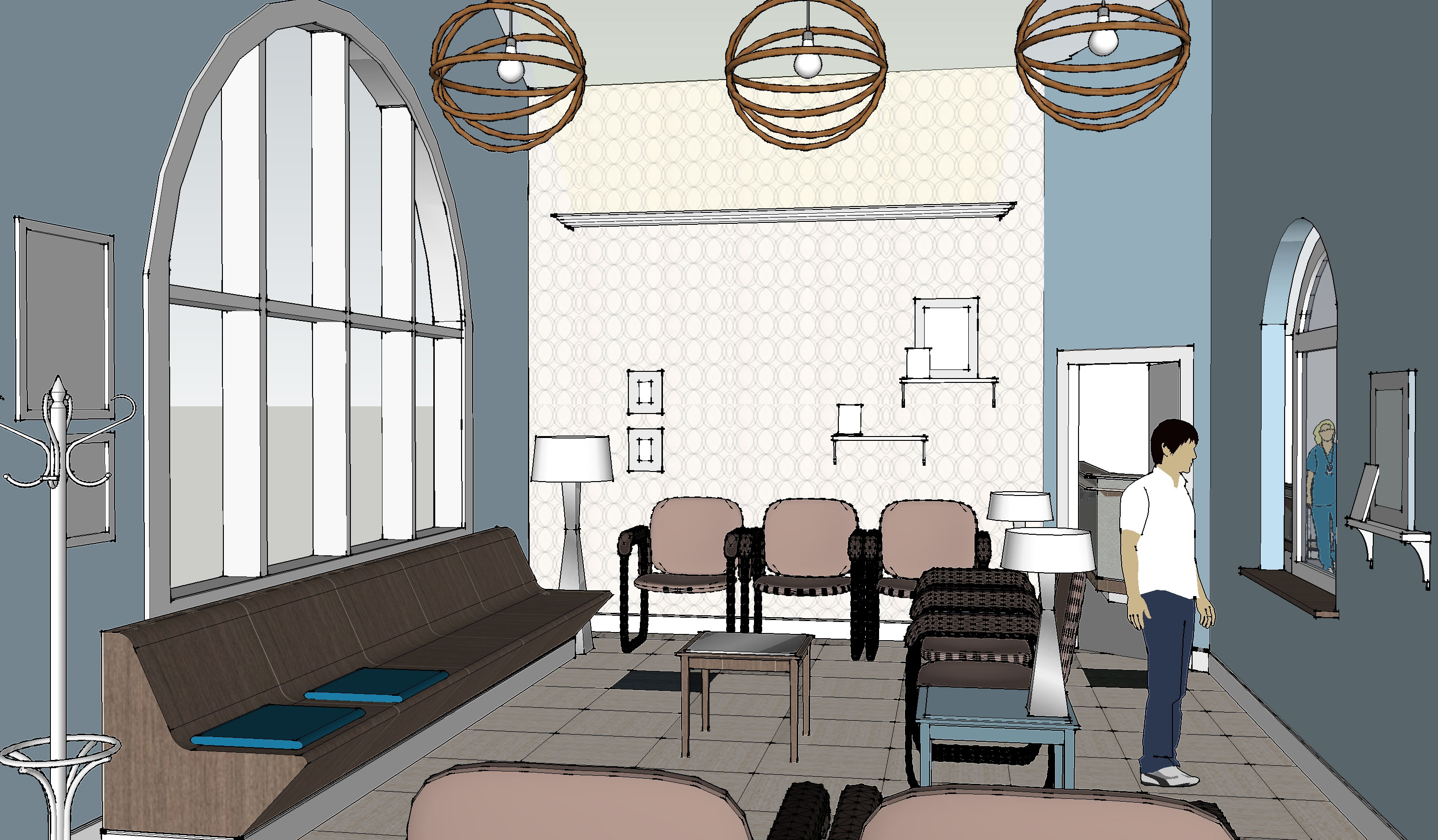
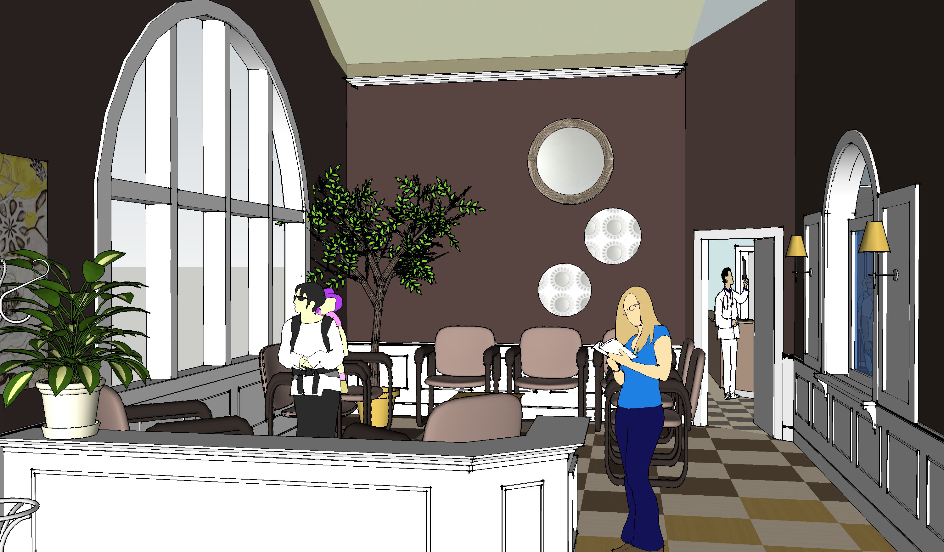
This blog is dedicated to the need for good interiors. I want to make a case for where we spend our time and how the aesthetic of places influences the vibe. There is a relation between happiness and color. Sprucing up where you sleep, eat, live, and work makes a positive impression on what you expect from yourself while being in certain places. The interior needs a balance of materials using color and texture. For example, the doctor’s office scheme below defines one interior using a background color and an accent, I arranged a carpet to look like it had a center mat. The mat is a contrasting color to the edge pieces. This use of carpet in two colors defines a room with a pattern of color, creates direction, and therefore interest. See more experiments with color, texture and arrangement below.

.
.

.
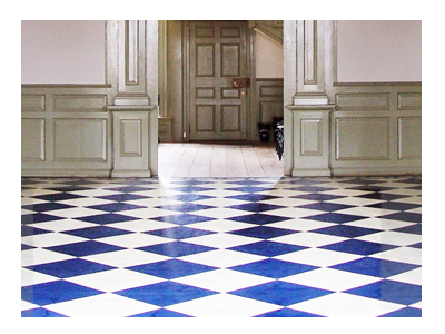
(In a concrete room a bright-colored rug makes the space)
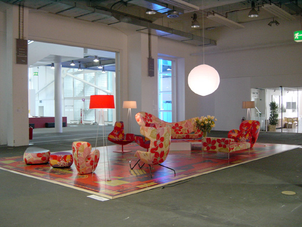
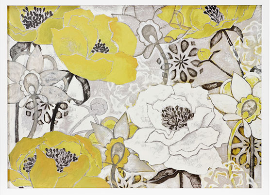
~Colors and Textures of even simple materials that make A Place~
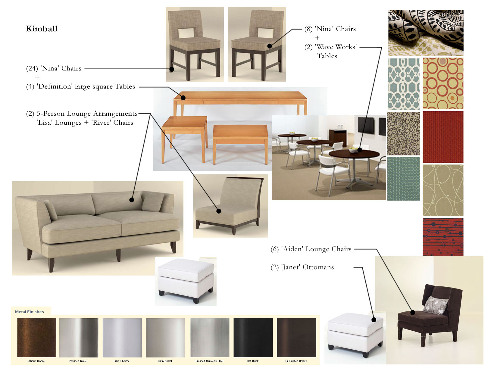
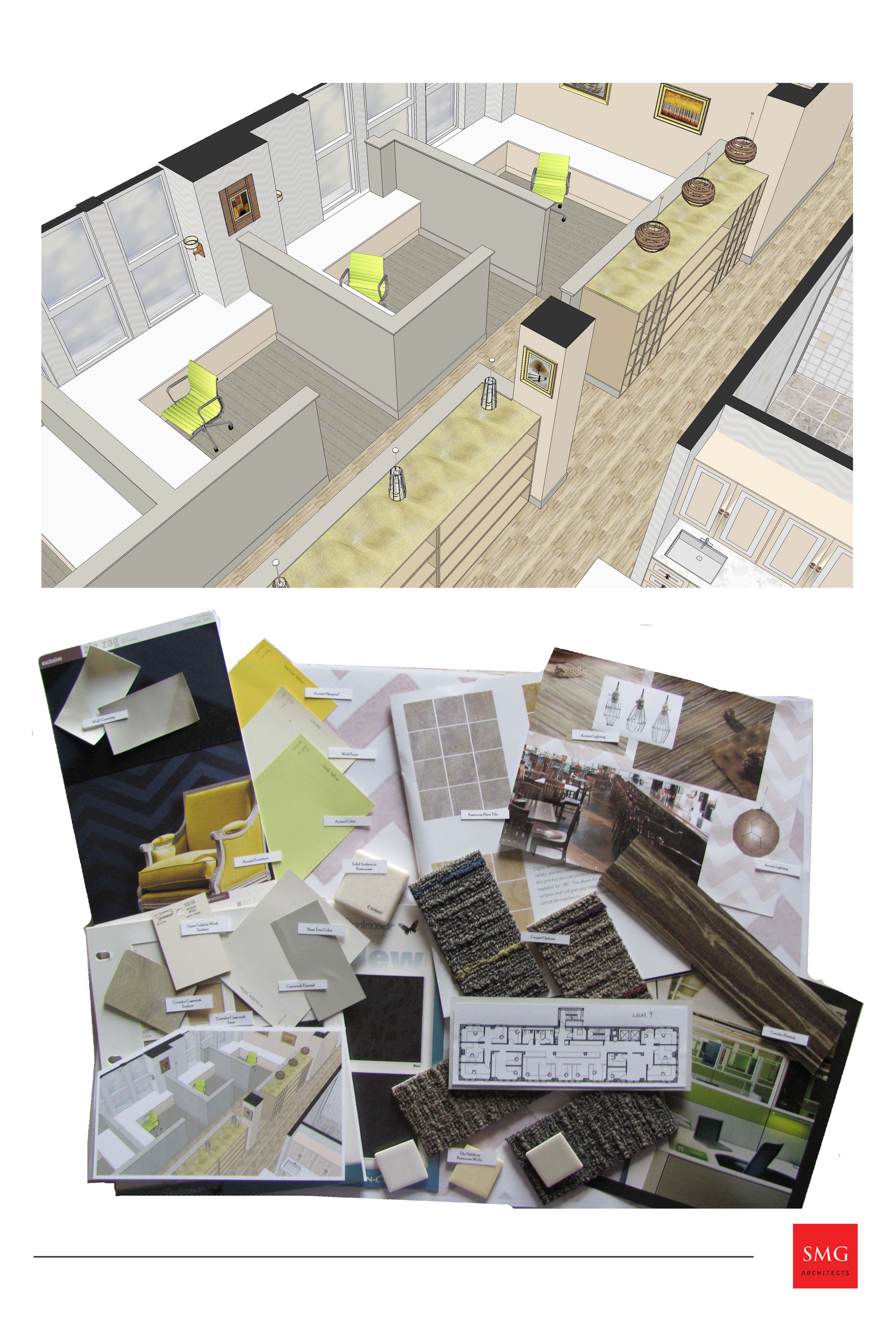
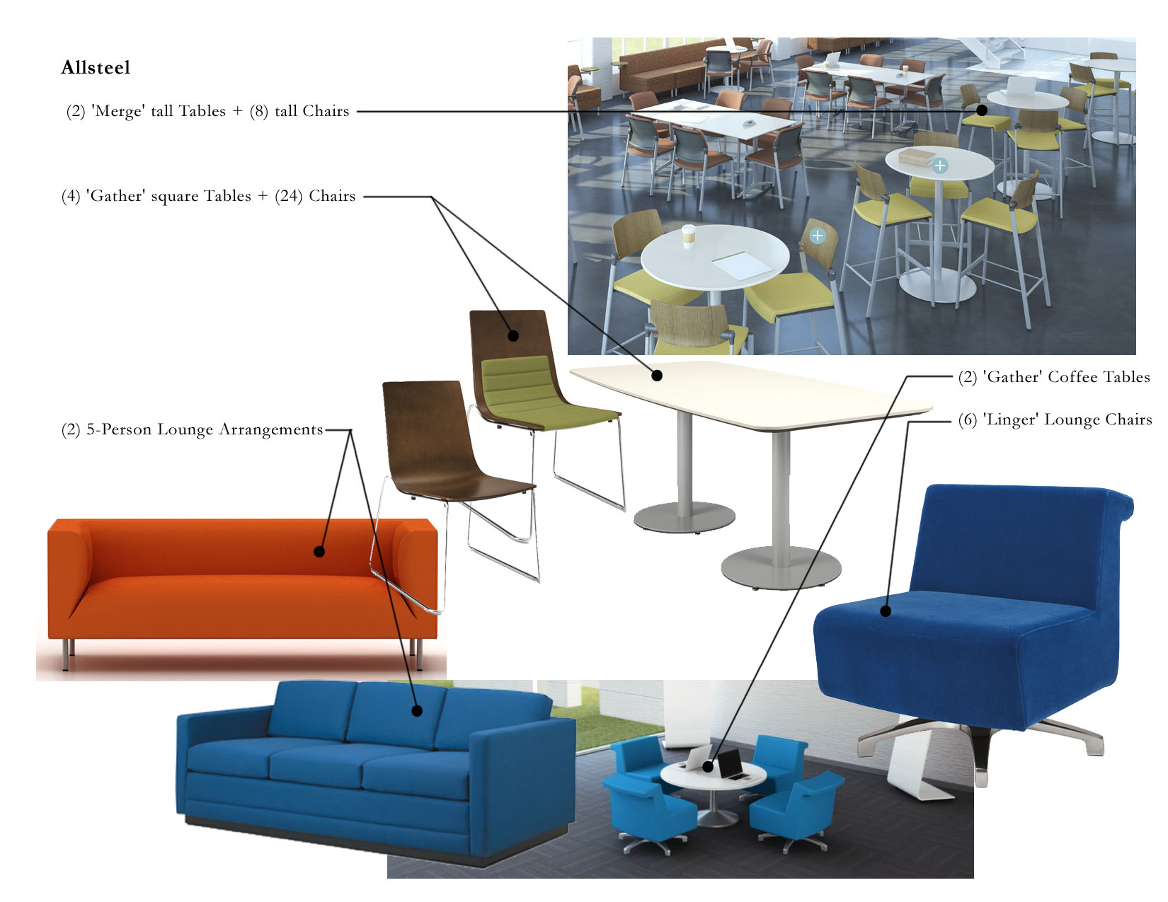
~Recent Finish Boards and Furniture Selections of my own Below~
~